
Job outcomes and salaries
Trends on salaries in each practice area, employment rate in legal jobs, and the job search.
Law School Graduate Salaries
Graduate salaries fall into two distinct groups more than $125,000 apart. Salaries largely keep up with inflation in the public sector and increased above inflation in the private sector in recent years.
Law school graduate salaries fall into a strange, arguably unhealthy pattern for a labor market. Whereas legal talent likely falls into a normal distribution, law school graduate salaries form a bi-modal distribution.
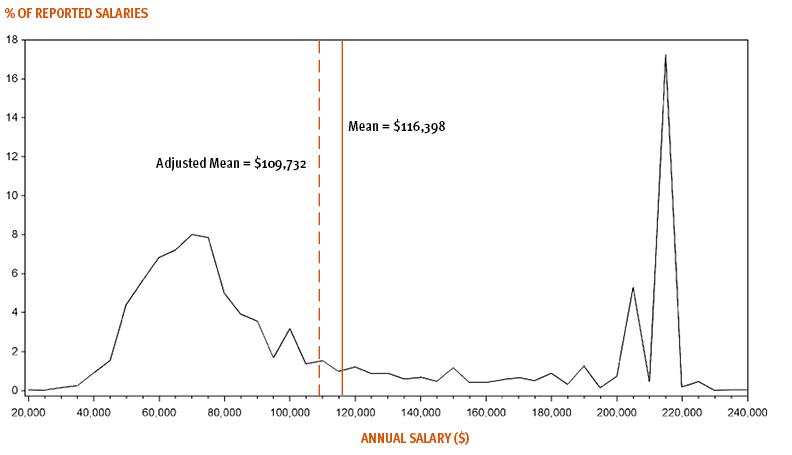
Salaries cluster into two disparate groups. The left-side group is between $50,000 and $90,000. This group accounts for a little over half of reported salaries. (The median reported salary was $85,000 in 2022.) The left-hand mode is best expressed as a range, $60,000 to $75,000, and accounts for about 30% of reported salaries. The right-side mode is actually two distinct peaks at $205,000 (5.3%) $215,000 (17.2%), with the latter being the biglaw market rate in 2022, for a total of about 22.5% of reported salaries. There are graduates between the ranges, but the gulf indicates a bidding war for top graduates. The bidding war has since resulted in increased salaries for top graduates, to $225,000 in 2023.
While this curve is instructive in many ways, it does overstate graduate salaries in two key ways. First, the curve only reflects employed graduates in full-time, long-term jobs. About 12.5% of the 2022 graduating class did not meet this specification. For NALP's purpose of understanding salaries post-law school, excluding non-employed graduates and graduates with part-time or short-term jobs makes sense. But if the purpose is to shed light on near-term graduate financial outcomes, the curve exhibits exclusion bias.
Second, the underlying salary data for long-term, full-time employed graduates suffer from non-response bias. Although the response group is quite large at 69% of all long-term, full-time employed graduates, the non-response group looks quite different. The response rate of graduates at large firms, which pay a lot, is much higher than at small firms, which pay significantly less. Jobs at the largest law firms (>250 attorneys) account for 39% of private practice jobs, but 49% of private practice salaries because the salary response rate is ~90%. The response rate declines with firm size. At the smallest firms (10 or less attorneys), the response rate is ~50%. These firms should represent 29% of private practice salaries, but only represent 21%.
It's logical that graduates with higher salaries are more likely to report than if they had a lower salary. That likely explains some of the gap. But another factor is that salaries at the largest law firms are publicly available through NALP. Public information also explains why judicial clerks and government employees have the very high salary response rates.
The bi-modal distribution demonstrates how the mean salary obscures a more complicated reality. NALP also includes an adjusted mean on the chart, but it adjusts only for non-responses and not for the excluded group, including non-employed graduates. Both the adjusted and non-adjusted mean are very sensitive to the proportion of large firm jobs. The U.S. Department of Education provides very helpful data based on what graduates report to the IRS.
The median, on the other hand, is not as sensitive to vastly higher salaries produced by that part of the labor market. The chart below shows the change over time of median salaries overall and by the type of employer (e.g. law firm or government). In each group, graduate salaries have steadily increased over time. But the overall median ("All Full Time") is still rather sensitive to the number of large firm jobs, though the effect is considerably more apparent when observing the median salary at law firms of any size.
The following chart compares median salaries by the type of employer, regardless of the type of job, in both real and current dollars. In recent years, the median salary has not kept up with inflation. The default view uses a base year of 2005 because that year was relatively stable and between the two recent recessions. To use a different base year, select it under "modify data" above. By default, only "All Full Time" is visible on the chart below. Toggle any category on the legend to toggle visibility.
The next chart examines salaries using both real and current dollars for law firms by size. By default, only the largest and smallest firm categories are visible on the chart below. Toggle any category on the legend to toggle visibility.
Salaries have largely kept up with inflation, but tuition has far exceeded inflation since 1985. This impacts the long-term value of the degree, while the near-term struggle to service student debt persists. Learn more about tuition trends.
Graduate salary data come from the National Association of Law Placement.
For tuition, nationwide averages from 1985 to 2013 come from the American Bar Association. Starting in 2014, LST calculates the nationwide average from individual schools, using data the schools reported to the American Bar Association. LST uses normal averages rather than weighted averages for the nationwide averages in 2014 and later. The ABA uses normal averages from 1985 to 2013.
LST uses the Consumer Price Index (CPI-U) for inflation, which covers 93% of the total U.S. population. Here's an an explanation of various indices to compare tuition over time.
Was this helpful?
Get your personal report
Answer a few questions, then get a list of schools tailored to your preferences.
See where you fit into the legal industry
Take a 30-minute assessment to gain valuable insights that will guide you in your career of law.